Showing posts with label tutorial. Show all posts

Tuesday, September 15, 2009

Tutorial Anyone?


I always have loads of fun altering photo frames, especially the inexpensive wooden ones from Ikea. This frame that I had in mind is for a good friend - Karen, so I thought I'd make a simple frame with just the letter "K" and no photos on it.

The supplies I used for this frame aren't many:

a) The Ikea frame,
b) 3 sheets of SEI papers from the Oasis collection,
c) epoxy stickers from SEI,
d) glimmer mist from Tattered Angels,
e) chipboard "K" from Maya Road,
f) stickles from Ranger and
g) foam dots.

1) First, I covered the outer frame and the background with patterned papers. Then I sprayed glimmer mist onto the K chipboard and let it dry. I chose the color green to match the patterned papers.


2) Once the K was dry, I added faux stitching (using a black pen) to give the letter more emphasis as I thought it looked a bit bland. Then I set aside the letter as I wanted to embellish the background first before adhering the letter.


3) I cut out the circle motifs and used them to embellish the background. Once I was satisfied with the placement of the circles, I adhered the "K" in the centre of the background.


4) I decided to embellish the upper left corner, and the lower right corner of the frame, to give the frame added interest, so I cut out some more circles, and leaves from another Oasis patterned paper. I layered the placement of these circles and leaves - gave them a bit of dimension with foam dots and epoxy stickers and adhered all onto the frame.

5) After everything was done, I added a small butterfly, which I cut out from the paper, and adhered it onto the letter K, and also added glitter glue (stickles) onto all the circles and butterfly for some bling, and my frame was done!


I hope you will give this project a try as it's really easy to do and you don't have to use too many supplies to make on. Just use papers from one collection as you will be rest assured that everything will match, add a few other things like maybe a chipboard image or some flowers onto the sides of the frame, and you're done!

Thanks so much! :)

Thursday, August 13, 2009

My Favorite Summertime Photos

If you could only describe summer through photographs, what would they be? Watermelon? A pool party? The beach? Here's a few of my favorite photos from this summer, as seen through the view finder of my cute little 1950's camera!


These are all true ttv photos. Through the Viewfinder photography (TtV) is defined as taking a picture of any subject "through the viewfinder" of any camera with another camera. I love the results I get, a digital image with the look of a vintage photo. I use an Anscoflex and sometimes a Duraflex camera. It's definitely become one of my favorite hobbies!!

Tuesday, August 11, 2009

Magnets, DIY project

This week, my 4 year old, Alaina, has started Kindergarten! It's so hard to believe that I have a child in school already, but I'm so excited for her. I wanted to create some different magnets for the fridge to proudly display all of her artwork and papers that she'll be bringing home. This project is the perfect reason to get out that over-flowing box of scrap paper, and create something useful and cute!


Repurposed Paper Magnets


Materials needed:
• magnets (I used rare-earth magnets)
• 1 inch circle punch
• little paper scraps & cardstock scraps
• glue (I like E6000 glue for my magnets)
• double sided tape
• Starbucks coffee sleeves


Directions:
1. Punch circles from the coffee sleeves

2. Working with the coffee sleeve circle, use a piece of double-sided tape placed in the center of the circle, and start to piece little scraps of paper next to one another, and some that are overlapping eachother.


3. Trim excess paper from around the circle as you go. (after this step I sewed the pieces of paper together for my magnets) Add a coat or 2 of mod-podge to seal the paper and let dry.

4. Using the E6000 glue, glue on a magnet to the smooth part of the coffee sleeve and let dry overnight.

And presto!! Cute perfectly pieced magnets, and completely made from your leftovers!!


Thursday, July 16, 2009

Smokey Eyes Done Right

I love this tutorial! If you can get this technique down, you'll look fabulous in your photos. The better the photo, the better the layout, right?

Growing up I loved makeup and would paint anyone’s face that would let me (and when I say paint, I mean that literally…sometimes the outcome was a bit scary. I’d like to think I’ve gotten a bit better over the years). About 5 years ago I had a little stint as a makeup artist. I worked in Southern California for a summer selling and doing makeup for all sorts of people. During this time I learned how to create the perfect smoky eye, great for summer nights!


Instructions: (the steps correspond with the above photo)
1. Start by curling your eyelashes (I recommend Covergirl’s lash curler).
2. Then brush your entire lids with a soft neutral shadow (I like Stila’s eye shadow shade: kitten).
3. Now, with a deep silver or gray eyeliner (I use Estee Lauder Artist Eye Liner color: slate with a great smudger on the end) thickly line the upper lash line.
4. Next it is key to smudge the liner to create a softer look rather than a harsh line. With a grey/brown loose eye shadow, softly brush the powder across your eyelids to the crease and lightly brush over your liner and under your bottom lashes (I like L’Oreal’s On-the-Loose shimmering powder, color: orb).
5. Now with a golden brown liner, trace your bottom lash line, I like to do a straight, slightly thick line to give a more dramatic feel (try Rimmel’s Special Eyes pencil in ginger tea).
6. Lastly, use a dramatic black mascara on your lashes - two coats will really give depth to the eye (I strongly recommend Clinique High Impact Mascara in black – it is a very wet and dramatic mascara).

That’s it! Now you are ready to transform into a summer goddess…enjoy.

Tuesday, July 14, 2009

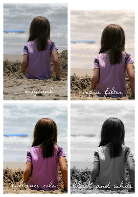
Guest Blogger- Photos feeling blue? Add some color!

I have a little motto I stick to when I create pages – the pictures are the focus! I know most of us aren’t professional photographers and our pictures don’t always look perfect, but I believe cropping and some small effects will help your ordinary photos look top notch!

1. Cropping can do wonders to an average photo. First you need to decide what you want in the photo. Most the time you are going to zoom way in – there always seems to be a lot of empty space. Do you want a horizontal or vertical photo? Get creative.

2.
Brightness/Contrast Most photos need some brightening and I like to use extra contrast. Do this by going to Image > Adjustments > Brightness/Contrast and then adjust to your liking.

3. Effects Lets look at some basic effects to ensure that your photo tells a story. Here are three different simple effects and the directions for using Photoshop (there are much more complicated ways of adjusting color in Photoshop, but I wanted to just stick with a couple easy ones).
• SEPIA FILTER – this does not necessarily change the color of your photo to shades of brown and tan, it just gives your photo an older, dreamy sort of feel. Go to Image > Adjustments > Photo Filter choose sepia filter and play with the density (I used 49% density on this photo).
• ENHANCE COLOR – this brightens all the colors in the photo and gives a more intense feel. Go to Image > Adjustments > Selective Color, here you should choose the colors in your photo from the drop down list and adjust each line to get a bold effect.
• BLACK & WHITE – I love black and white photos - they have such a timeless look and feel. The key to making B&W photos look amazing is to play with the color contrast. In this case you will change your photo to B&W before you change the brightness and contrast. Go to Image > Adjustments > Black & White, then use your brightness/contrast tool generously.

Good luck and have fun with it!

Thursday, May 14, 2009

DIY Housewarming Gifts

I love making treats look pretty and then giving them away. The process and assembly of projects like this are very therapeutic to me, and also extremely satisfying. And who doesn't like to get cute treats? I've compiled some of my favorite DIY projects so hopefully you'll get into the giving spirit and make something for that neighbor that you haven't met yet!

Homemade Bread and Jam


Chocolate Bark and Candied Pecans


Planted Banana Nut Bread


Wednesday, May 13, 2009

Spicing Things Up

The baby tie tutorial was so much fun that I almost feel bad posting something new today. Trust me though, I think this tutorial from Heather is worth it. Maybe we can all become fabulous photographers... or at least improve. Thanks Heather! (P.S. Visit Heather's blog to see what else she's been up to this week.)

I've compiled some easy ways to get fun, candid, unique photos! I'll just jump right into them:

Capturing Their Personality:
The BEST way to get great photos of your child is to just let them be themselves! I think that candid photos are the best! Try to pick out their happiest time of day to bring the camera out. Try not to get too pose-y with them because most likely they'll get bored and not cooperate with you. Try to capture you child expressing their unique personality. Follow them around the yard, or put a fun toy by a window inside, let them go at it, and shoot away (with your camera, of course).


What To Wear:
I'm always a big fan of color! Bright, bold colors are always great, especially on kids! If you want to go for a print, choose a large print. Sometime small, detailed prints are too busy and don't look the best in photos. Accessories and layers add a lot to a photo, too. Scarves, fun shoes, hats, and bracelets are just a few ideas.


Props:
A great way to get fun photos is spice things up a bit! I always encourage clients to bring props to use in their shoots. I think it adds dimension and zest to the photo and just brings in the "wow" factor. I've used couches, a big sucker, picture frames, brightly colored chairs...the options are endless!


Tuesday, May 12, 2009

Baby Tie Tutorial

A few weeks ago Heather needed a tie for her baby. She came up with this ingenious technique and today she's going to share it with us. Hip hip hooray! (p.s. isn't the model adorable?)


Monday, May 11, 2009

For the Love of Light

I believe, actually I know that it's possible to take a great photo with a point and shoot camera. You don't have to have a big, fancy professional camera to achieve great composition and lighting. When I'm about to take a photo, the first thing I do is turn off the flash. When it's the middle of the day and there's pretty sunlight coming through your window, that's the best time to take photos!
I have a mini photo shoot with my 5 month old son every Tuesday to document his growth. I open all of the windows in the room so it's nice and bright, turn off my flash and snap away! Here's a checklist of reminders for taking pictures with window light:

*Don't use direct, harsh sunlight, just the pretty luminosity from the afternoon sun
*Make sure your flash is off
*Hold your camera as still as possible when you're snapping the shot
*Make sure your subject (or your child's face) is facing the light to avoid shadows

Although there are circumstances where flash is necessary (night time, dark rooms, etc.) I try to avoid it at all possible so that faces don't look too washed out and colors are more natural. Experiment with it! Have fun!

(I didn't edit or change anything about these photos. They're straight out of the camera)

Thursday, February 26, 2009

Simple Tutorial Conclusion

If you're just tuning in for this week, you'll want to scroll down and read the Monday and Wednesday entries. They look long, but they make for really fast reading, including illustrations for each. We're continuing on with the third and last guideline for simple, memorable page layouts, using the two sample layouts from Monday's post.

3. Embrace negative space.

"Negative space" refers to the undecorated, or "background" portion of any piece of artwork or graphic material.

Now that you've visualized a grid for your scrapbook page (Monday's tutorial), and you've laid out the elements so that their hierarchy tells the right story (yesterday's tutorial), you might be tempted to fill in all the little empty spaces that are left. Resist the temptation! That negative space is doing as much to help your layout tell its story as the grid and the page hierarchy. The eye takes more in when it has wide open space around what's really important. Think of it like trying to have a meaningful conversation with a friend in a busy subway station, versus chatting with that friend on a nice, quiet bench in the park.

Below, Layout 1 obviously fills up every little space with paper, ink, brads, stickers, and so on. You might say it looks like all of the components for that layout were mixed up really well in a blender and just poured out on the page. In addition to how busy all of those embellishments make the layout feel, there's another simple reason to leave that negative space empty: moolah. That's right. Money. When you add up the cost for all of the embellishments and papers we used on Layout 1, you're looking at a whopping $27.44! Granted, you will still have embellishments leftover for other projects. But let's face it - how many of us have drawers of leftover embellishments that we mean to use again, but never do?


Now, Layout 2 fills in a lot of the negative space around the photo and caption with squares of textured and patterned papers and linen. But those squares contain negative spaces that give the whole page a light, breathable freshness to complement the sunny Easter morning shown in the photo. Also, the negative space in between the squares hints at the "invisible" grid structure, and emphasizes the hierarchy of the page elements. And last, but not least, the paper and embellishments for Layout 2 end up costing $14.98. That's just over half the cost of Layout 1, and again you've got leftovers, if you think you'll use them.


Well, that concludes our tutorials on using simple composition to make the pages of your scrapbook meaningful. Like we mentioned in November's type tutorial, guidelines of this sort are based on principles of good design, but they're still flexible. Start each layout following the basic principles, and then trust your design instincts to tell you where and how to bend the rules. Each page you create will tell the story it's meant to tell.

Again, let us know what you think of these design tutorials. Feel free to comment whether you like them or not, and why, what you would change, and what you might be interested in covering in future posts. We love your feedback!

More projects, tips and tricks, and give-aways on the way!

Wednesday, February 25, 2009

Simple Tutorial Continued

If you're just tuning in for this week, you'll want to scroll down and read the Monday entry. It looks long, but it's a fast read. We're continuing on with another guideline for simple, memorable page layouts, using the two sample layouts from the last post.

2. It's all about the page hierarchy.

"Page hierarchy" refers to the organization of the elements in any piece of artwork or graphic material, so that the artwork delivers its message in the right order.

Think of each page in your scrapbook like it has a story to tell. The grid is one of many tools to help you put the story in order on each page. Good page hierarchy simply means that the eye is properly led from the first element of the story to the last. Other things that help you emphasize different elements on a page in their right order are size (bigger items demand more attention first), and color (brighter, warmer hues obviously steal the show), among others.

Below, there are numbers in front of the different page elements for both Layouts 1 and 2, with the size of the number showing what order your eye is most likely to move through them. Lots of patterns, overpowering embellishments, and the haphazardly placed photo and text all make Layout 1 a jumbled blur. There isn't a coherent story for your eye to focus on, and Layout 1 will most likely be forgotten as soon as the page is turned.

Layout 2 is more memorable because your eye can focus on the image first and foremost, fixing it in your mind. The caption comes next, so that the image is mentally tied with its story. And lastly, the eye is then free to wander from one little square tile to the next, subtly associating the memory of the image and its story with textures and impressions of, in this case, a bright, sunny Easter day.

Did you notice that there isn't a title on Layout 2? Not every layout needs one. Including titles on layouts is very much a matter of personal preference. Where the caption explains the picture fairly well, and it complements the simplicity of the page, I decided not to add one.


Come back and visit us tomorrow for the final installment for this tutorial. And thank you for all of your responses to our plea for help! We heard you loud and clear and we're cooking up some good stuff for the weeks to come.

Monday, February 23, 2009

Simplicity

Sorry this week's post is a day late. We spent all of yesterday trying to fit a tutorial about simplicity and layout composition into one blog post, and it simply won't work! So, this morning we'll set the stage for a discussion about assembling meaningful and attractive scrapbook pages, and then we'll keep the conversation going with two or three more posts over the next couple of days.

Let's talk about simplicity. The famous English poet, William Wordsworth, said, "How many (people) undervalue the power of simplicity! It is the real key to the heart."

We live in a crazy, busy world, and it's easy for all the noise and distractions to crowd out what really matters in life. Usually, the things that do matter - like family and friends, favorite places, and beloved memories - end up on the pages of our scrapbooks! So, when scrapbooking any of life's simple pleasures, the last thing we want is for the busy-ness of the scrapbook page to crowd out the simple beauty of the subject.

These days, gorgeous paper is an important part of just about every scrapbook layout. Also, embellishments provide a fun and sometimes funky way to attach images to a page, spell out our thoughts, and add a creative touch to memory keepsakes. The trick to using these resources in scrapbooking is finding the right balance between enhancing your layouts, and overwhelming them. Albert Einstein said it best, "Everything should be made as simple as possible, but not simpler."

The pictures below present two example layouts showcasing the same photo. Layout 1 has a lot of potential, but it's what we're going to use as our example of a cluttered, overwhelmed layout. Most of the techniques used on Layout 1 look great on their own, or in combination with one or two other techniques. Together, though, the techniques are so busy it's easy to miss the picture right in the center of it all.

Layout 1

Layout 2 is our example of a simpler, more memorable layout.

Layout 2


Here, then, is the first of three guidelines we'll be sharing over the next few days, for using simple composition to complement the content of your scrapbook projects.

1. The grid is your friend.

The "grid" simply refers to an underlying structure of any piece of artwork or graphic material.

The grid, in scrapbooking terms, is the set of implied horizontal, vertical, and circular lines that guide where page elements are laid out. You cannot see it directly. But you can tell where the lines are by how photos, labels, and pieces of paper line up across the page. In layouts where you want to convey faithfulness, honesty, warmth, comfort, strength, and happiness, a page divided into four sections (vertically, horizontally, or both) is the way to go. We used a four by four grid for Layout 2. For layouts that feature adventure, spontaneity, fun times, play time, love, variety, and family, dividing the page into thirds works really well.

Below, you'll see both Layouts 1 and 2 with an overlay of the grid lines on each. Is the grid for Layout 2 more pleasing to your eye? Why? Because the human eye loves pattern and repetition. It's perfectly fine to alter that pattern, and breaking out of the grid with one or two page elements usually creates visual interest. But the mish-mashed grid in Layout 1 leaves your eye confused on where to focus, on what's important (click the image below to enlarge for detail).


Basically, think of an attractive grid like it's the Yellow Brick Road of your layout. Your layout can have a straight forward grid that leads you right where you want to go, or the grid can wind it's way through the layout, with visual adventures along the way, inviting you to turn the next page. The main goal in setting up a simple grid is to lead your eyes to a brilliant memory at the end of the road.

More to come! Check back tomorrow for the second guideline to simple, beautiful composition!

Tuesday, February 10, 2009

Club SEI February Video Instructions

For those of you that are Club SEI members, you should be receiving your February Kit very soon, if you haven't already. The kit has tons of embellishments and 24 sheets of various Lovebirds papers (including die-cut lace!), and instructions to make several layouts.

There are also a couple of die-cut projects this month that are fresh and exciting departures from run-of-the-mill scrapbooking, including an origami mini album! These projects might seem difficult at first, but they're super easy if you have someone to show you how they're put together.

So, we made some instructional videos and uploaded them on YouTube. There are four of them - from one to six minutes long - that cover making the die-cut origami mini album (in two parts), the die-cut favor box, and the picture frame stand.

Here are parts one and two of the mini-album instructions:


Here are instructions for the die-cut gift box:


And lastly, the instructions for the picture frame stand:

Friday, February 6, 2009

Combining Patterns


Whenever we create a new paper collection we try to make the papers very user-friendly. Here are some things we take into consideration that may help you when you are combining papers. I used Lovebirds for my example, but these principles apply to any collection or mix of collections. You can even apply these when you are combining patterns in your home decorating.

Principle 1: Size
You want to have a variety of pattern sizes. If all the patterns are the same scale, they will fight for attention and don’t layer well together.

Principle 2: Type/Complexity
Some patterns are very bold and others are calm. Many times this is because a pattern has many elements that repeat randomly, while other patterns have only one element that repeats very predictably. There are also geometric patterns and organic patterns. If you combine too many bold or complex patterns, it will get too busy. It is nice to have some calm patterns or solids mixed in.

Principle 3: Style
We generally keep each paper collection the same style throughout. For example is the style whimsical, sophisticated, etc... This helps make the patterns easier to combine.

Principle 4: Color
When choosing the colors you want to use, it is best to have one dominant color, some less dominant colors and one or two accent colors. Your dominant color is the color you use most. The accent color is used to make things “pop” or to add contrast so everything doesn’t get too “muddy”.

Another thing to consider with color is warm colors (red, orange & yellow), cool colors (green, blue & usually purple), and neutrals. If you use a lot of colors from the same group, it will create a calm and unified look.

These are just a few things to keep in mind as you are combining patterns. The basic principle is unity with variety. Make sure to keep your patterns unified (color and style are great ways to do this) and mix in some variety (size and type/complexity are great for variety). It can be tricky but usually a lot of fun too. Once you understand why some things work better than others, you will learn when to take a risk and break the rules and when to stick to what works.

Now do you know which pattern combination works better in the image at the top and why? Do you have any tips or questions on combining patterns that you can share? We love your comments!

Thursday, November 20, 2008

Club SEI's November Video Instructions

OOPS! Josh accidentally deleted this post about the November Club SEI kit, with the video tutorial for the star album.

Here's that video again:


Monday, November 10, 2008

You Can Type


They say a picture speaks a thousand words. All the same, a layout with lots of pictures and no type is like a cupboard full of spices with no labels – if you can’t remember what each one is by sight, you’ll end up putting curry in your apple pie. But type does more than just label and date your photos! Page titles, captions, and “journaling” capture what your photos may not: what you felt and thought when they were taken.

Still, the decorative scrapbook papers available today are meant to showcase your pictures, not long blocks of text. But it’s not just the length of type on your page that’s important. The size, font, and placement of your type, and also the words you use, can make your text the perfect compliment to all your memories.

So how do you avoid distracting readers with unsightly type? Here is a list of a few things to keep in mind:

1. Choose words that have meaning.
  • I’m probably going to offend some people when I say this, but certain words have become unfortunate hallmarks of cookie-cutter scrapbooking, such as “Cherish!”, “Dream!”, “Discover!”, etc.
  • The best scrapbook titles and captions come from familiar (not cliché) phrases, like “Jingle All the Way!” for a layout about sleigh rides and Christmas caroling. Or, “Snips & Snails, and Puppy Dogs’ Tails” for a young boy’s layout.
  • If you want to use a single or double word title, avoid obvious nouns, like “Christmas Tree” with a photo of a family picking out what is obviously a Christmas tree. To capture the frosty, pine-scented mood of the evening, perhaps “O Tannenbaum” would be better (“christmas tree” in German, but people fondly associate this with the famous song).
2. Pick fonts that are appropriate to your content.
  • If you’re using your computer to generate type, avoid over-used fonts, like Papyrus, Comic Sans, Vivaldi, Times New Roman, Brush Script, and Curlz. Also, if you’re worried that a font’s letter forms may seem over the top, they probably are. Pick something similar, but a little more modest.
  • If you’re buying chipboard letters, rub-on words, and other type embellishments, be selective! With so many choices out there in scrapbook elements, if you spend the time looking, you will find the perfect font for your project.
  • Looking for more free fonts for your computer? I recommend www.dafont.com.

3. Keep your type readable.
  • Our eyes are governed in large part by habits and patterns, especially when it comes to reading text. In western cultures, our eyes are trained to read from left to right, top to bottom. In general, then, titles, captions, and journal entries should follow this format.
  • Avoid breaking words up into their individual letters, and for the most part, keep all the letters of a word on the same line.
  • Our eyes also prefer smooth, even patterns in text. Every once in a while it’s alright to break the mould, like using an elegant cursive capital letter to start a word in a plain text (serif) font. But using several fonts on a single layout, or worse yet, using several fonts in a single word, makes it hard to read. The designer’s general rule of thumb is preferably two fonts per layout, and no more than three.
Well, that covers a few of the basics. There are more guidelines to successfully using type in your scrapbooking, but we can cover those later. The most important thing is to trust your own design instincts – do what looks good. After all, as any artist or designer will tell you, it’s important to learn the basic principles, so you know when and just how much to break them!

If you’re interested in follow up type tutorials, please comment.